About one month ago, we released what is probably the largest change to Acunote burndown charts since their inception. User feedback has been mostly positive, though some users had questions about interpretation of the new Area Burndown charts. We will discuss Area Burndowns in detail later in this post. Here is a summary of the recent enhancements to Acunote burndown charts:
New Look
We refreshed the look of our burndown charts. In general, they have just become a lot nicer. Important changes are the new color scheme with easily distinguishable colors and better y-axis scaling. Large teams and organizations will appreciate that legends will no longer grow infinitely and cover your chart. Magnified versions of the chart will show the legend to the right of the drawing area, displaying up to 30 usernames in the legend.
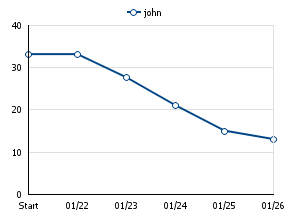
New Prediction
The team burndown chart will use the new prediction algorithm to predict how much work the team will get done in the future. This prediction is displayed as a dashed line that starts from today and spans until the end of the sprint.
Prediction Burndown Chart
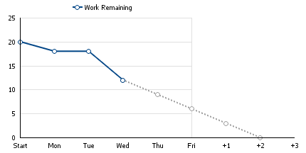
This prediction replaces the approximation line we showed before.
New Area Burndown
We replaced two of our additional burndown types (the ones called alternative and incremental) with the new "Area Burndown". Both alternative and incremental burndowns were used to see the changes in the amount of work planned for a sprint. But they had their share of problems. For example, differential burndown didn't allow for predictions and incremental burndown was unreadable for large teams.
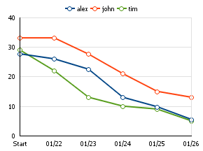
Area burndown displays the work amount (just like the old incremental burndown) and draws stacked areas that represent the work remaining for the team or for each user (in case of multi-user burndown). Such chart makes it easy to see not only how the work amount changes during a sprint, but at which rate the work is being completed.
Area Burndown Chart
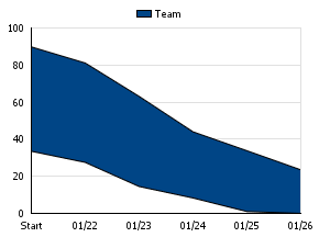
Line burndowns are useful for predictions, but they don't show you information about when work is added in the middle of a sprint. To visually get this information you can use Area Burndowns. Area Burndowns are designed to show added work by increasing the distance between the work remaining line and the horizontal axis (called the "baseline"). Each time a new task is added at the middle of a sprint, the baseline goes down by the estimate of that task.
With that technique the upper line of the Area Burndown chart looks exactly the same as a one line burndown thus allowing for predictions. At the same time, the descending baseline in the Area Burndown indicates work added to the sprint in progress.
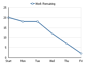
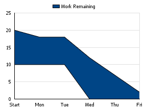
| Line Burndown | Area Burndown |
|
|
The table below illustrates how the Area Burndown chart above is calculated:
| Start | Monday | Tuesday | Wednesday | Thursday | Friday | |
|---|---|---|---|---|---|---|
| Task 1 (10h estimate) | 10 | 8 | 8 | 4 | 1 | 0 |
| Task 2 (10h estimate) | 8 | 6 | 2 | |||
| Sum of Work Remaining, S | 10 | 8 | 8 | 12 | 7 | 2 |
| Baseline, B | 10 | 10 | 10 | 0 | 0 | 0 |
| Work Remaining (inc.), S+B | 20 | 18 | 18 | 12 | 7 | 2 |
Since the amount of work can't be negative we show the whole chart above the zero line.
User Burndown Filtering
"My work remaining" chart has been replaced by the more flexible "User Burndown". By default it shows your burndown like the old chart did. But it is possible now to see a single burndown for any other user. Just filter the tasklist for a user and the burndown will be refreshed with that user's chart.
| Single User Burndown | Multi-User Burndown |
|
|
New Terminology
As you may have noticed already, we changed our terminology a bit. The word "Burndown" is used everywhere instead of "Work Remaining" and burndowns are classified by their chart type - Line or Area. The table below summarizes all changes:
| Old Name | New Name |
| Individual Work Remaining | Multiuser Line Burndown |
| User's Work Remaining | User Line Burndown |
| Team Work Remaining | Team Line Burndown |
| Individual Work Remaining (alternative) | N/A (removed) |
| User's Work Remaining (alternative) | N/A (removed) |
| Team Work Remaining (alternative) | N/A (removed) |
| Individual Work Remaining (incremental) | Multiuser Area Burndown |
| User's Work Remaining (incremental) | User Area Burndown |
| Team Work Remaining (incremental) | Team Area Burndown |
What do you think of these burndown charts?
We hope you find these new and improved burndown charts help you and your team to become more Agile. Here at Acunote, where we all eat our own cooking and drink from the proverbial kool-aid fountain, we have become quite avid fans of the new burndown charts, so we are pleased to finally share them with you. Let us know what you think of these new charts.